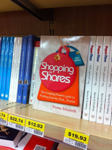
Would you like to see the new cover for the 2nd edition of Shopping for Shares (due out September 2011?) Awesome because here it is! Love the bright colours and the way the title really stands out.
As you can see the designers have gone away from the bright pink to use a combination of colours which are still girly but a bit more sophisticated.
I haven’t seen it in print version yet, but I’m told it looks even better in real life than it does on screen.
Hopefully lots of people will be able to see it from the bookshelves (for those bookstores that will still be around in September that is).
Also there will be digital versions for most ebook readers as well which I’m super excited about.
Do you like it? What do you think.

